AI Use by Companies within the S&P500
Hannah Usadi
3/11/2025
library(gt)
og_df <- read.csv("/Users/hannahusadi/Downloads/AI_Use_by_Companies S&P500/core.csv")
#colnames(data)

# Check the data type of each column
#str(og_df)
Data Source
I found my data on the Emerging Technology Observatory (ETO) website through a “Data is Plural” newsletter. The Private-Sector AI Indicators dataset tracks AI-related research, patents, and hiring across global companies, using proprietary methods from ETO and CSET (Center for Security and Emerging Technology) to analyze diverse data sources. The data was collected in May of 2024.
Understanding the Data Structure
What does the dataset look like?
The data has 691 rows, representing company observations, and 63 columns, covering various variables. The variables are focused on both qualitative and quantitative metrics, including company metadata, research, workforce, and patents.
# Count data types
data_types <- sapply(og_df, class)
summary_table <- table(data_types)

# Create a summary sentence
summary_sentence <- paste(
  "The dataset contains", ncol(og_df), "columns, including",
  paste(summary_table, names(summary_table), collapse = ", "), "variables."
)

# Print the summary
cat(summary_sentence)
The dataset contains 63 columns, including 15 character, 44 integer, 4 numeric variables.#Filter for s&p 500 only:
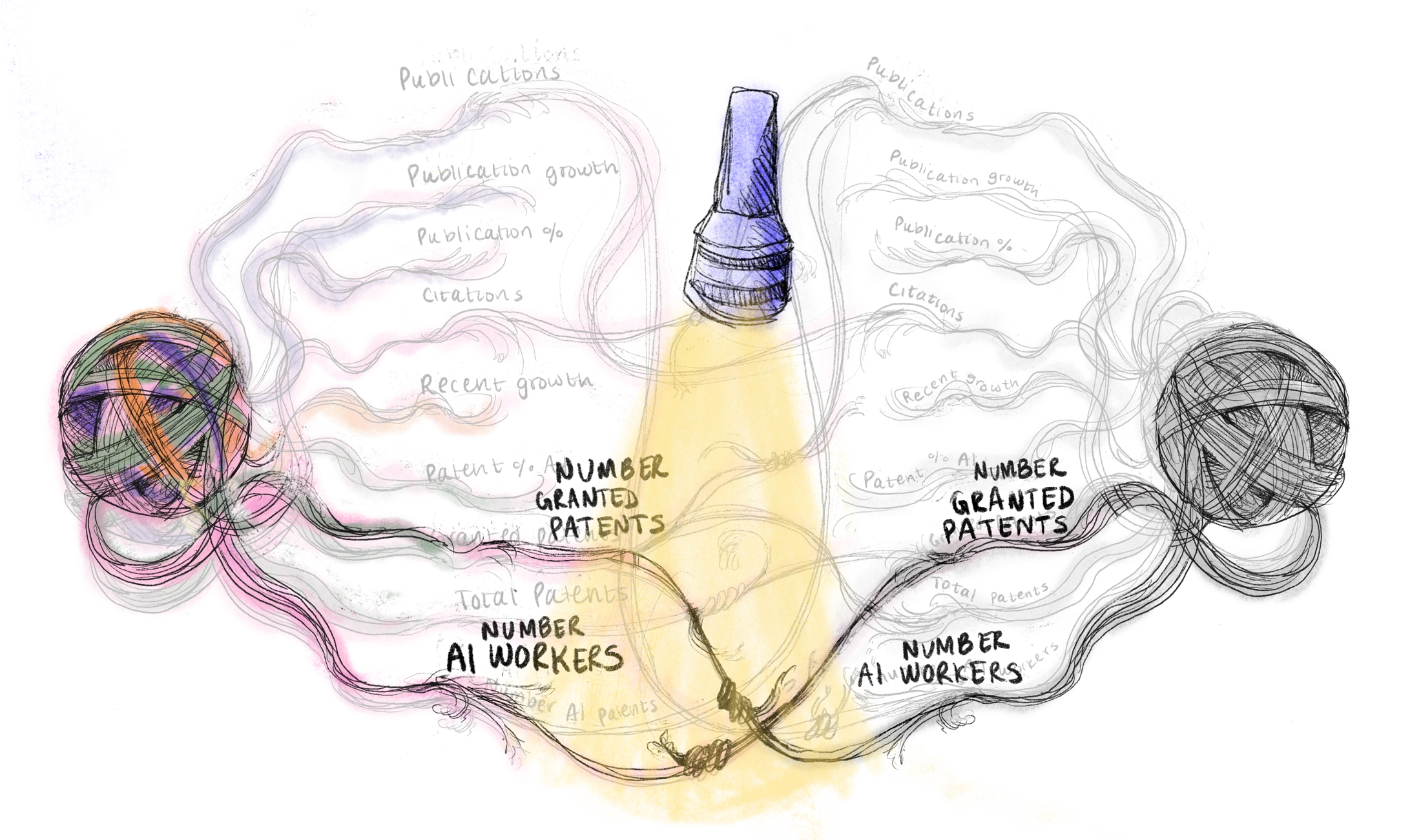
df <- og_df %>% filter(str_detect(Groups, "S&P 500"))That’s a lot of variables! The data, unorganized, is like a ball of yarn with lots of threads and colors.

Image 1: Messy Data
Let’s tackle the yarn ball by first filtering down to companies within the S&P500 only and checking for any defective threads. Reducing the data down from the S&P500 shaved the the data frame from 691 rows to 500 rows.
Are there missing values or duplicates?
na_val <- colSums(is.na(df))  # Check missing values per column

# Filter for columns with NAs (values > 0)
na_val_filtered <- na_val[na_val > 0]

# Print clean output
if (length(na_val_filtered) > 0) {
  cat("Columns with missing values:\n")
  for (col in names(na_val_filtered)) {
    cat(col, "has", na_val_filtered[col], "missing values.\n")
  }
} else {
  cat("No missing values in the dataset.\n")
}
Columns with missing values:
Publications..Recent.AI.publication.growth has 257 missing values.
Patents..AI.patents..recent.growth has 298 missing values.# Calculate the number of NAs per column
na_val <- colSums(is.na(df))
# Identify columns with NAs
cols_with_na <- names(na_val[na_val > 0])
# Remove rows that have NA in any of these columns
#df <- df[complete.cases(df[, cols_with_na]), ]The recent growth in AI patents and publications are both missing values! This is because they were only calculated for companies with substantial patent data. Companies with missing data could be assumed to have minimal growth.
Organizing the Data into Sub Categories
63 is a lot of variables - too many to intutively understand. To get a better grasp of the data, I organized it into 4 main buckets:- Company Metadata
- AI Research & Publications
- AI Patents & Innovation
- AI Workforce
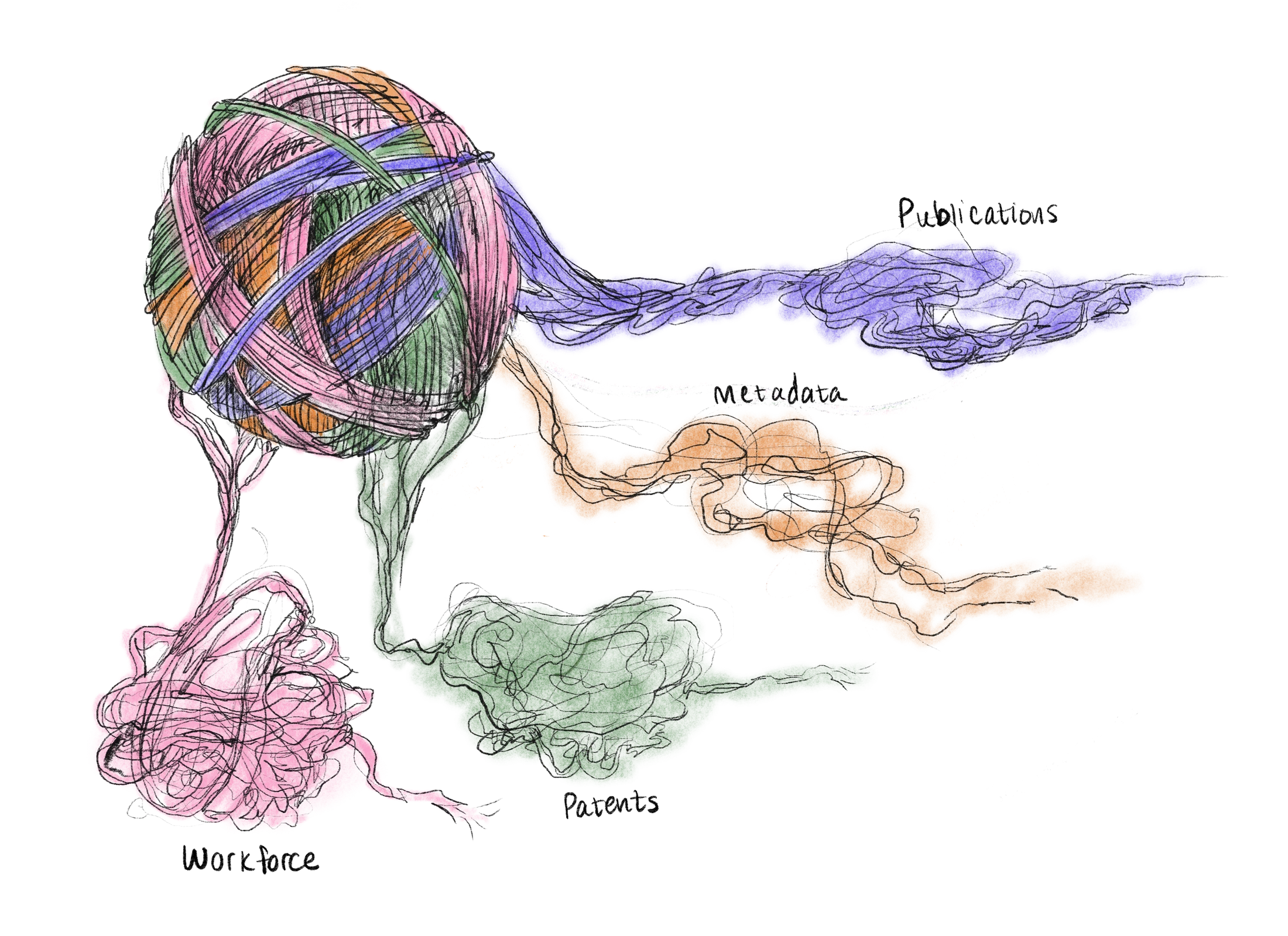
Image 2: Data Buckets
Below is an example of one of the data frame buckets. This data frame contains the dataset’s “metadata” and is much easier to examine and work with.
# Function to clean column names by removing text before ".."
clean_column_names <- function(data) {
  data %>%
    rename_with(~ sub(".*\\.\\.", "", .x))
}

# ---- 1. Company Metadata ----
company_metadata <- df %>%
  select(Name, Country, City, State.province,
         Groups, Region, Stage, Sector)

# ---- 2. AI Research & Publications ----
ai_research <- df %>%
  select(Name, Groups, Country, Stage, Sector,
         Publications..AI.publications, Publications..Recent.AI.publication.growth,
         Publications..AI.publication.percentage, Publications..AI.publications.in.top.conferences,
         Publications..Citations.to.AI.research, Publications..CV.publications,
         Publications..NLP.publications, Publications..Robotics.publications,
         Publications..AI.safety.publications, Publications..Large.language.model.publications,
         Publications..Total.publications) %>%
  clean_column_names()

# ---- 3. AI Patents & Innovation ----
ai_patents <- df %>%
  select(Name, Groups, Country, Stage, Sector,
         Patents..AI.patents, Patents..AI.patents..recent.growth,
         Patents..AI.patent.percentage, Patents..Granted.AI.patents,
         Patents..Total.patents, Workforce..AI.workers,
         starts_with("Patents..AI.use.cases"),  # AI use case patents
         starts_with("Patents..AI.applications.and.techniques")
  ) %>% # AI applications & techniques patents
  clean_column_names()

# ---- 4. AI Workforce & Employment ----
ai_workforce <- df %>%
  select(Name, Groups, Country, Stage, Sector, Workforce..AI.workers, Workforce..Tech.Team.1.workers) %>%
  clean_column_names()


# ---- Compact & Styled Table Function ----
display_small_gt_table <- function(data, title) {
  data %>%
    head(3) %>%
    gt() %>%
    tab_header(
      title = md(paste0("**", title, "**"))
    ) %>%
    tab_options(
      table.font.size = px(12),
      data_row.padding = px(2),
      table.border.top.width = px(0),
      table.border.bottom.width = px(0),
      column_labels.border.top.width = px(0),
      column_labels.border.bottom.width = px(1),
      table.width = pct(60)
    ) %>%
    tab_style(
      style = cell_text(align = "left"),  # Left-align the title
      locations = cells_title(groups = "title")
    ) %>%
    fmt_number(
      columns = where(is.numeric),
      decimals = 1,
      use_seps = TRUE
    ) %>%
    cols_align(
      align = "center",
      columns = everything()  # Center-align all columns
    ) %>%
    cols_width(
      everything() ~ px(100)  # Ensure equal column widths
    ) %>%
    cols_label(
      Name = "Company"
    ) %>%
    tab_style(
      style = list(
        cell_fill(color = "lightgrey"),  # Grey background for column headers
        cell_text(weight = "bold", align = "center")  # Bold text in headers
      ),
      locations = cells_column_labels(everything())
    )
}


# ---- Display Compact Tables with Titles ----
display_small_gt_table(company_metadata, "Company Metadata")| Company Metadata | |||||||
| Company | Country | City | State.province | Groups | Region | Stage | Sector |
|---|---|---|---|---|---|---|---|
| Accenture | Ireland | Dublin | Dublin | S&P 500 | Europe | Mature | Software & IT Services |
| Cognizant | United States | Teaneck | New Jersey | S&P 500 | North America | Mature | Software & IT Services |
| Amazon | United States | Seattle | Washington | S&P 500, Global Big Tech | North America | Mature | Retailers |
#display_small_gt_table(ai_research, "AI Research & Publications")
#display_small_gt_table(ai_patents, "AI Patents & Innovation")
#display_small_gt_table(ai_workforce, "AI Workforce & Employment")
Creating a Condensed Data Set
Now that our data is better organized, I want to uncover potential relationships that exist between the variables.
But there’s too many variables to cross reference all 63… where do I start?
I simplified the data into a “condensed df”, providing a higher level overview of the variables. The columns were reduced to the 9 main variables, illustrated below.

Figure 3: Condensed Data Diagram Representation
I then looked at correlations within this condensed data frame to provide an higher level overview of what relationship categories would be worth exploring further.
Finding Relationships within the Condensed Data Set
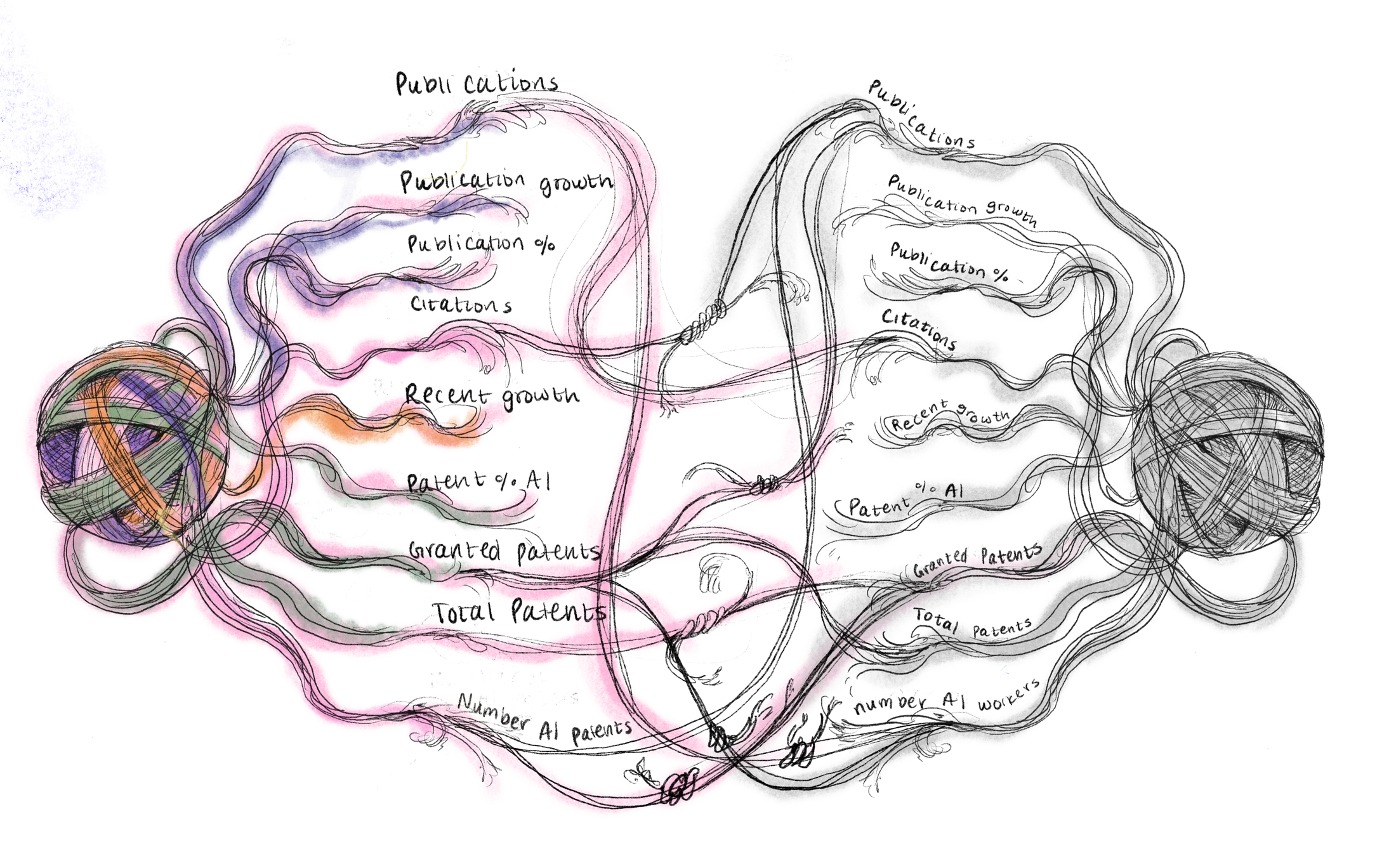
Figure 4: Correlation Between Significant Data Variables
I found links between the variables using a correlation matrix.
#Create a summary matrix to compare data with a correlation matrix but with less granularity
# Compute correlation matrix
# ---- Step 1: Create condensed_df with key numerical variables ----
condensed_df <- df %>%
  select(
    # --- AI Research & Publications ---
    Publications..AI.publications,
    Publications..Recent.AI.publication.growth,
    Publications..AI.publication.percentage,
    Publications..Citations.to.AI.research,

    # --- AI Patents & Innovation ---
    Patents..AI.patents..recent.growth,
    Patents..AI.patent.percentage,
    Patents..Granted.AI.patents,
    Patents..Total.patents,

    # --- AI Workforce & Employment ---
    Workforce..AI.workers,
    Workforce..Tech.Team.1.workers
  )

# ---- Step 2: Clean column names ----
condensed_df <- condensed_df %>%
  rename_with(~ sub(".*\\.\\.", "", .x))  # Removes text before ".."

# ---- Step 3: Compute the correlation matrix ----
condensed_cor <- cor(condensed_df, use = "pairwise.complete.obs")

# ---- Step 4: Remove Upper Triangle for Half-Heatmap ----
condensed_cor[upper.tri(condensed_cor)] <- NA  # Set upper triangle to NA

# Convert matrix to long format for ggplot
cor_melted <- melt(condensed_cor, na.rm = TRUE)

# ---- Step 1: Create condensed_df with key numerical variables ----
condensed_df <- df %>%
  select(
    # --- AI Research & Publications ---
    Publications..AI.publications,
    Publications..Recent.AI.publication.growth,
    Publications..AI.publication.percentage,
    Publications..Citations.to.AI.research,

    # --- AI Patents & Innovation ---
    Patents..AI.patents..recent.growth,
    Patents..AI.patent.percentage,
    Patents..Granted.AI.patents,
    Patents..Total.patents,

    # --- AI Workforce & Employment ---
    Workforce..AI.workers
  )

# ---- Step 2: Clean column names ----
condensed_df <- condensed_df %>%
  rename_with(~ sub(".*\\.\\.", "", .x))  # Removes text before ".."

# ---- Step 3: Compute the correlation matrix ----
condensed_cor <- cor(condensed_df, use = "pairwise.complete.obs")

# ---- Step 4: Remove Upper Triangle for Half-Heatmap ----
condensed_cor[upper.tri(condensed_cor)] <- NA  # Set upper triangle to NA

# Convert matrix to long format for ggplot
cor_melted <- melt(condensed_cor, na.rm = TRUE)

# ---- Step 5: Plot Heatmap Without Square Tiles ----
ggplot(cor_melted, aes(Var2, Var1, fill = value)) +
  geom_tile(color = "white") +  # Normal (non-square) tiles
  scale_fill_gradient2(
    low = "pink", mid = "white", high = "deeppink", midpoint = 0,
    name = "Correlation", limits = c(-1, 1)
  ) +
  geom_text(aes(label = round(value, 2)), size = 3) +  # Keeps text readable
  theme_minimal(base_size = 14) +
  theme(
    axis.text.x = element_text(angle = 45, hjust = 1, size = 10),  # Rotated x-axis labels
    axis.text.y = element_text(size = 10),
    plot.title = element_text(size = 14, face = "bold"),
    legend.position = "bottom",
    legend.key.size = unit(0.4, "cm"),  # Smaller legend for better spacing
    plot.margin = margin(15, 15, 15, 15)  # Adds spacing around the plot
  ) +
  labs(
    title = "Correlation Heatmap (Condensed Data)",
    x = "",
    y = ""
  ) +
  guides(fill = guide_colorbar(barwidth = 12, barheight = 1))  # Wide color legend for clarity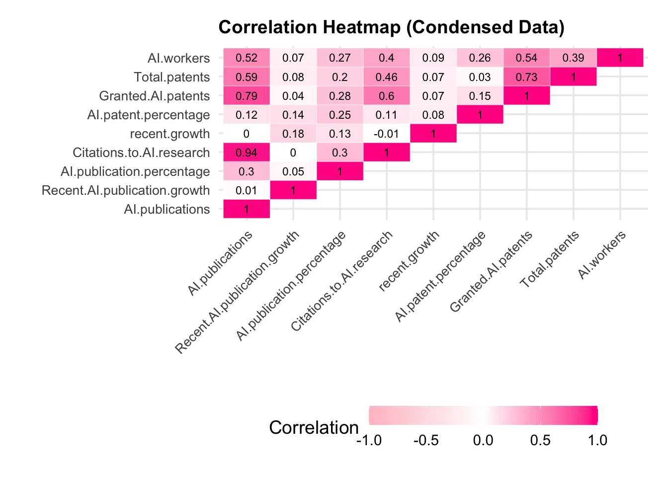
From the correlation matrix, we can see strong relationships between variables highlighted in deep pink. However, some of these relationships are somewhat expected, such as “Citations to AI Research” and “AI Publications” or “Total Patents” and “Granted AI Patents”. That’s not super intriguing…
What relationships are worth digging into?
Below is a breakdown of positive relationships from the correlation matrix to get a better understanding of our options:
# Assuming your correlation matrix is already in 'condensed_cor'

# 2. Extract Correlations by Tiers
tier1 <- which(abs(condensed_cor) >= 0.5 & abs(condensed_cor) < 0.7, arr.ind = TRUE)
tier2 <- which(abs(condensed_cor) >= 0.7 & abs(condensed_cor) < 0.9, arr.ind = TRUE)
tier3 <- which(abs(condensed_cor) >= 0.9 & abs(condensed_cor) <= 1, arr.ind = TRUE)

# 3. Format the Results for Table
format_correlations_table <- function(tier_data, cor_matrix) {
  if (nrow(tier_data) == 0) {
    return("No correlations in this tier.")
  }

  results <- data.frame(row_index = numeric(), col_index = numeric(), correlation = numeric())
  for (i in 1:nrow(tier_data)) {
    row_index <- tier_data[i, 1]
    col_index <- tier_data[i, 2]

    # Only include the lower triangle of the matrix to avoid duplicates.
    if(row_index > col_index){
      corr_value <- cor_matrix[row_index, col_index]
      results <- rbind(results, data.frame(row_index = row_index, col_index = col_index, correlation = corr_value))
    }
  }

  # If there were no correlations in the lower triangle, return the no correlations string.
  if(nrow(results) == 0){
    return("No correlations in this tier.")
  }

  # Sort by correlation value (smallest to largest)
  results <- results[order(results$correlation), ]

  formatted_results <- c()
  for (i in 1:nrow(results)) {
    var1 <- colnames(cor_matrix)[results$row_index[i]]
    var2 <- colnames(cor_matrix)[results$col_index[i]]
    corr_value <- results$correlation[i]

    # Ensure both variables are separately bolded, but "and" remains normal
    formatted_results <- c(formatted_results, paste0("- **", var1, "** and **", var2, "** (<em>", round(corr_value, 3), "</em>)"))
  }

  return(paste(formatted_results, collapse = "\n")) # Use proper Markdown newlines for list format
}

tier1_results <- format_correlations_table(tier1, condensed_cor)
tier2_results <- format_correlations_table(tier2, condensed_cor)
tier3_results <- format_correlations_table(tier3, condensed_cor)

# 4. Create gt Table
library(gt)

table_data <- data.frame(
  Tier = c("0.5 - 0.7", "0.7 - 0.9", "0.9 - 1.0"),
  Correlations = c(tier1_results, tier2_results, tier3_results)
)

gt_table <- gt(table_data) %>%
  tab_header(title = "Correlation Strength by Tier") %>%
  cols_align(align = "center", columns = Tier) %>%
  fmt_markdown(columns = Correlations) %>%
  tab_style(
    style = cell_borders(
      sides = "bottom",
      color = "lightgrey",
      weight = px(1)
    ),
    locations = cells_body(
      columns = everything(),
      rows = everything()
    )
  ) %>%
  tab_style(
    style = cell_fill(color = "lightgrey"),
    locations = list(
      cells_column_labels() # Only highlight column labels, not the "Tier" values
    )
  ) %>%
  tab_style(
    style = cell_text(color = "#FFB6C1", weight = "bold"), # Light pink text for 0.5 - 0.7
    locations = cells_body(columns = Tier, rows = 1)
  ) %>%
  tab_style(
    style = cell_text(color = "#FF69B4", weight = "bold"), # Medium pink text for 0.7 - 0.9
    locations = cells_body(columns = Tier, rows = 2)
  ) %>%
  tab_style(
    style = cell_text(color = "#FF1493", weight = "bold"), # Deep pink text for 0.9 - 1.0
    locations = cells_body(columns = Tier, rows = 3)
  ) %>%
  tab_options(
    table.font.size = px(12) # Makes the font smaller
  )

# 5. Output to R Markdown
gt_table| Correlation Strength by Tier | |
| Tier | Correlations |
|---|---|
| 0.5 - 0.7 |
|
| 0.7 - 0.9 |
|
| 0.9 - 1.0 |
|
One interesting relationship appears between AI workers and granted patents.
How does this relationship hold across various companies within the S&P500?
I’m curious about digging into a more granular analysis.
Digging Deeper into Granted AI Patents and the Workforce Behind Them
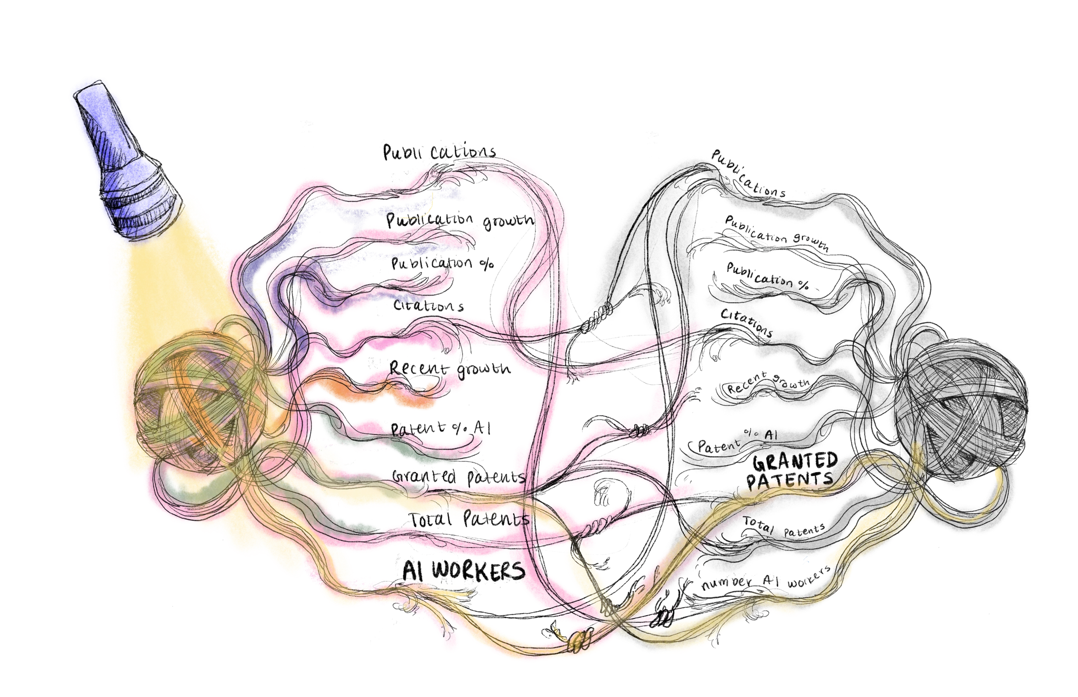
How does workforce volume (“AI.workers”) relate to granted AI patents (“Granted.AI.patents”) across different sectors?
First, let’s get a good idea of just the AI workforce distribution across sectors. I broke out the software sector into its own visualization due to its huge range of outliers. Note the much larger scale on the axis representing 15,000 workers.
Univariate Analysis: Workforce Volume by Sector
library(ggplot2)
library(dplyr)
library(patchwork)

# Identify the top 8 sectors
top_8_sectors <- ai_patents %>%
  filter(Sector != "Unknown") %>%
  count(Sector) %>%
  arrange(desc(n)) %>%
  head(8) %>%
  pull(Sector)

# Assign sector abbreviations
filtered_data <- ai_patents %>%
  filter(Sector %in% top_8_sectors) %>%
  mutate(Sector_Abbrev = case_when(
    Sector == "Software & IT Services" ~ "Software",
    Sector == "Technology Equipment" ~ "Tech Equipment",
    Sector == "Pharmaceuticals & Medical Research" ~ "Medical",
    Sector == "Healthcare Services & Equipment" ~ "Healthcare",
    Sector == "Health Care" ~ "Health",
    Sector == "Banking & Investment Services" ~ "Finance",
    Sector == "Telecommunications" ~ "Telecom",
    Sector == "Chemical Industry" ~ "Chemicals",
    TRUE ~ Sector  # Keeps any unmatched names unchanged
  )) %>%
  mutate(Sector_Abbrev = factor(Sector_Abbrev))

# Filter out Software for this plot
other_sectors_data <- filtered_data %>% filter(Sector_Abbrev != "Software")

# Determine upper limit for y-axis
y_max_other <- max(other_sectors_data$AI.workers, na.rm = TRUE) * 1.1  # Add 10% padding

# Create boxplot for the other 7 sectors
top_7_plot <- ggplot(other_sectors_data, aes(x = Sector_Abbrev, y = AI.workers, fill = Sector_Abbrev)) +
  geom_boxplot(color = "black", alpha = 0.8, outlier.shape = 16, outlier.size = 2) +
  ylim(0, y_max_other) +
  labs(
    title = "AI Workforce Distribution\nby Top Sectors",
    subtitle = "Companies\nRepresented in the S&P 500,\nExcluding Software",
    x = "Sector",
    y = "AI Workforce Volume"
  ) +
  theme_minimal(base_size = 12) +
  theme(
    axis.text.x = element_text(size = 7, angle = 45, hjust = 1),
    axis.text.y = element_text(size = 10),
    plot.title = element_text(size = 14, face = "bold"),
    plot.subtitle = element_text(size = 8),
    panel.grid.major = element_blank(),
    panel.grid.minor = element_blank(),

    legend.position = "none"  # Remove the legend
  ) +
  scale_y_continuous(labels = scales::comma)

top_7_plot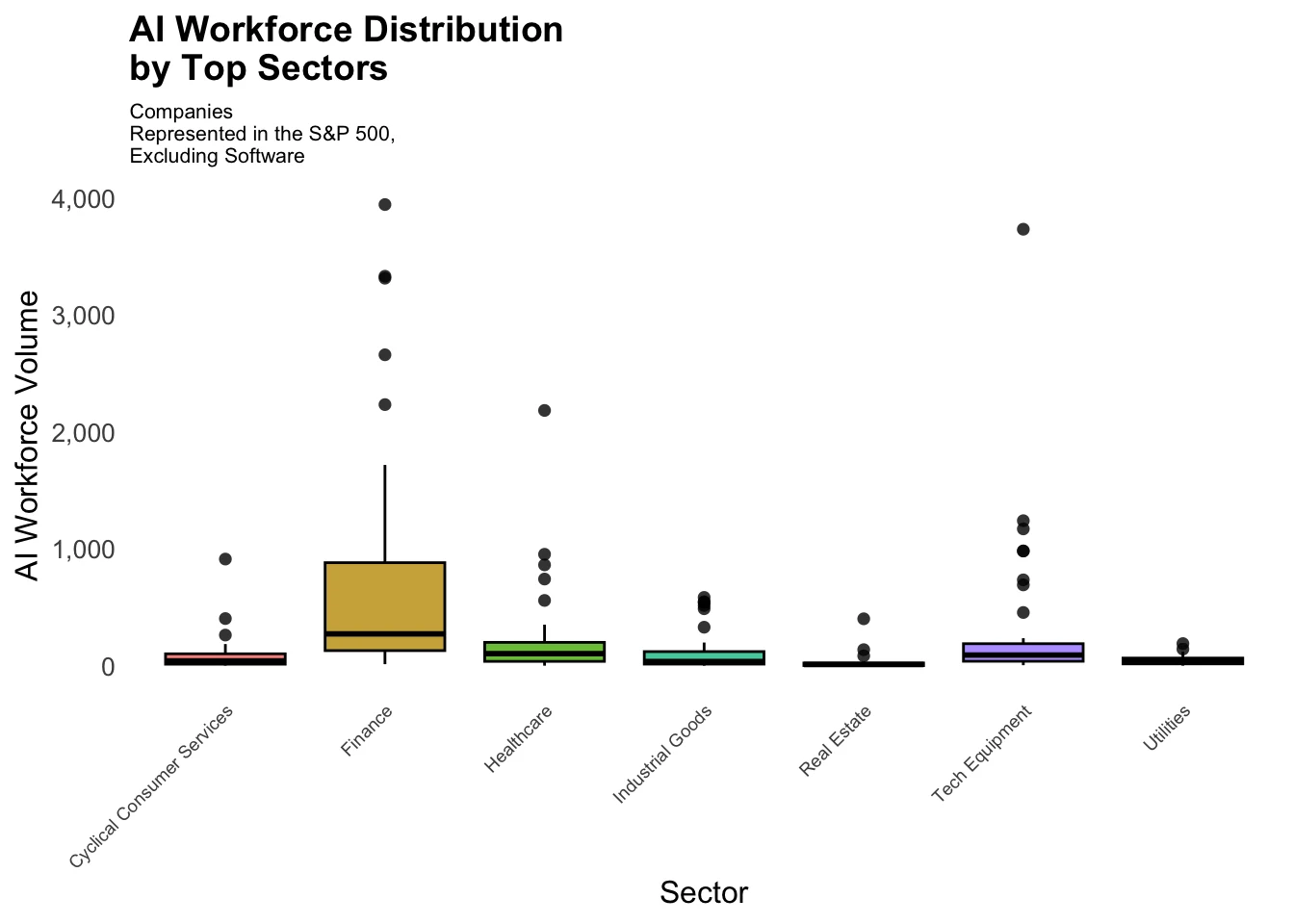
library(ggplot2)
library(dplyr)
library(ggrepel)

# Filter only Software data
software_data <- filtered_data %>% filter(Sector_Abbrev == "Software")

# Find the top 3 companies in Software by AI workforce
top_software_outliers <- software_data %>%
  arrange(desc(AI.workers)) %>%
  head(1)

# Determine upper limit for y-axis (Software only)
y_max_software <- max(software_data$AI.workers, na.rm = TRUE) * 1.1  # Add 10% padding

# Create a normal boxplot with blue data points
software_boxplot <- ggplot(fill = "#008080", software_data, aes(x = Sector_Abbrev, y = AI.workers)) +
  geom_boxplot(fill = "#008080",color = "black", alpha = 0.5, outlier.shape = NA) +  # Normal boxplot
  geom_jitter(color = "blue", size = 2, width = 0.15, alpha = 0.8) +  # Blue data points
  geom_text_repel(data = top_software_outliers,
                  aes(label = Name, y = AI.workers),
                  size = 3, color = "black",
                  nudge_y = 0.05 * y_max_software,
                  direction = "x",
                  box.padding = 0.1,
                  point.padding = 0.1,
                  max.overlaps = Inf) +
  ylim(0, y_max_software) +
  labs(
    title = "AI Workforce Distribution\nin the Software Sector",
    subtitle = "Software Companies\nRepresented in the S&P 500",
    x = "Sector",
    y = "AI Workforce Volume"
  ) +
  theme_minimal(base_size = 12) +
  theme(
    axis.text.x = element_text(size = 10),
    axis.text.y = element_text(size = 10),
    plot.title = element_text(size = 14, face = "bold"),
    plot.subtitle = element_text(size = 8),
    panel.grid = element_blank(),
    legend.position = "none"
  ) +
  scale_y_continuous(labels = scales::comma)  # Format large numbers

top_7_plot + software_boxplot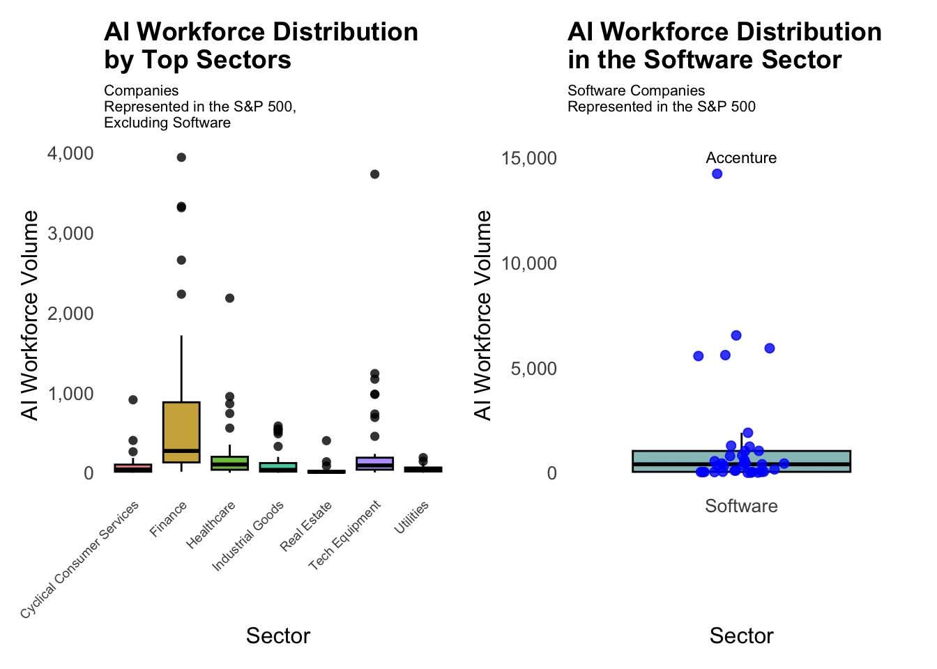
This box plot chart tells us a few things:
- Apart from software, the finance sector has both the greatest average and range of AI focused workers.
- While the Healthcare, Medical, Tech Equipment sectors have outlier companies with a high number of AI focused employees, their distribution is within a relatively smaller range of approximately 500 workers.
- The finance sector, on the other hand, has a large inner quartile range of approximately 2,000 workers, demonstrating the large variation.
Now, let’s look at the number of total granted patents by sector.
Univariate Analysis: Granted AI Patents by Sector
# Identify the top 8 sectors
top_8_sectors <- ai_patents %>%
  filter(Sector != "Unknown") %>%
  count(Sector) %>%
  arrange(desc(n)) %>%
  head(8) %>%
  pull(Sector)

# Assign sector abbreviations
filtered_data <- ai_patents %>%
  filter(Sector %in% top_8_sectors) %>%
  mutate(Sector_Abbrev = case_when(
    Sector == "Software & IT Services" ~ "Software",
    Sector == "Technology Equipment" ~ "Tech Equipment",
    Sector == "Pharmaceuticals & Medical Research" ~ "Medical",
    Sector == "Healthcare Services & Equipment" ~ "Healthcare",
    Sector == "Health Care" ~ "Health",
    Sector == "Banking & Investment Services" ~ "Finance",
    Sector == "Telecommunications" ~ "Telecom",
    Sector == "Cyclical Consumer Services" ~ "Consumer Services",
    TRUE ~ Sector  # Keeps any unmatched names unchanged
  )) %>%
  mutate(Sector_Abbrev = factor(Sector_Abbrev))

# Aggregate the total granted AI patents by abbreviated sector
sector_patent_summary <- filtered_data %>%
  group_by(Sector_Abbrev) %>%
  summarise(Total_Granted_Patents = sum(Granted.AI.patents, na.rm = TRUE)) %>%
  arrange(desc(Total_Granted_Patents))

# Step 3: Create the Bar Plot
ggplot(sector_patent_summary, aes(x = reorder(Sector_Abbrev, -Total_Granted_Patents), y = Total_Granted_Patents)) +
  geom_bar(stat = "identity", fill = "#FF69B4", color = "black", alpha = 0.6) +
  labs(
    title = "Total Granted AI Patents as of May 2024",
    subtitle = "for companies represented in the top 8 sectors of the S&P500",
    x = "Sector",
    y = "Total Granted Patents"
  ) +
  theme_minimal(base_size = 12) +
  theme(
    panel.grid = element_blank(),
    axis.text.x = element_text(size = 10, angle = 45, hjust = 1),
    axis.text.y = element_text(size = 10),
    plot.title = element_text(size = 14, face = "bold"),
    plot.subtitle = element_text(size = 10)
  ) +
  scale_y_continuous(labels = scales::comma)  # Format y-axis labels with commas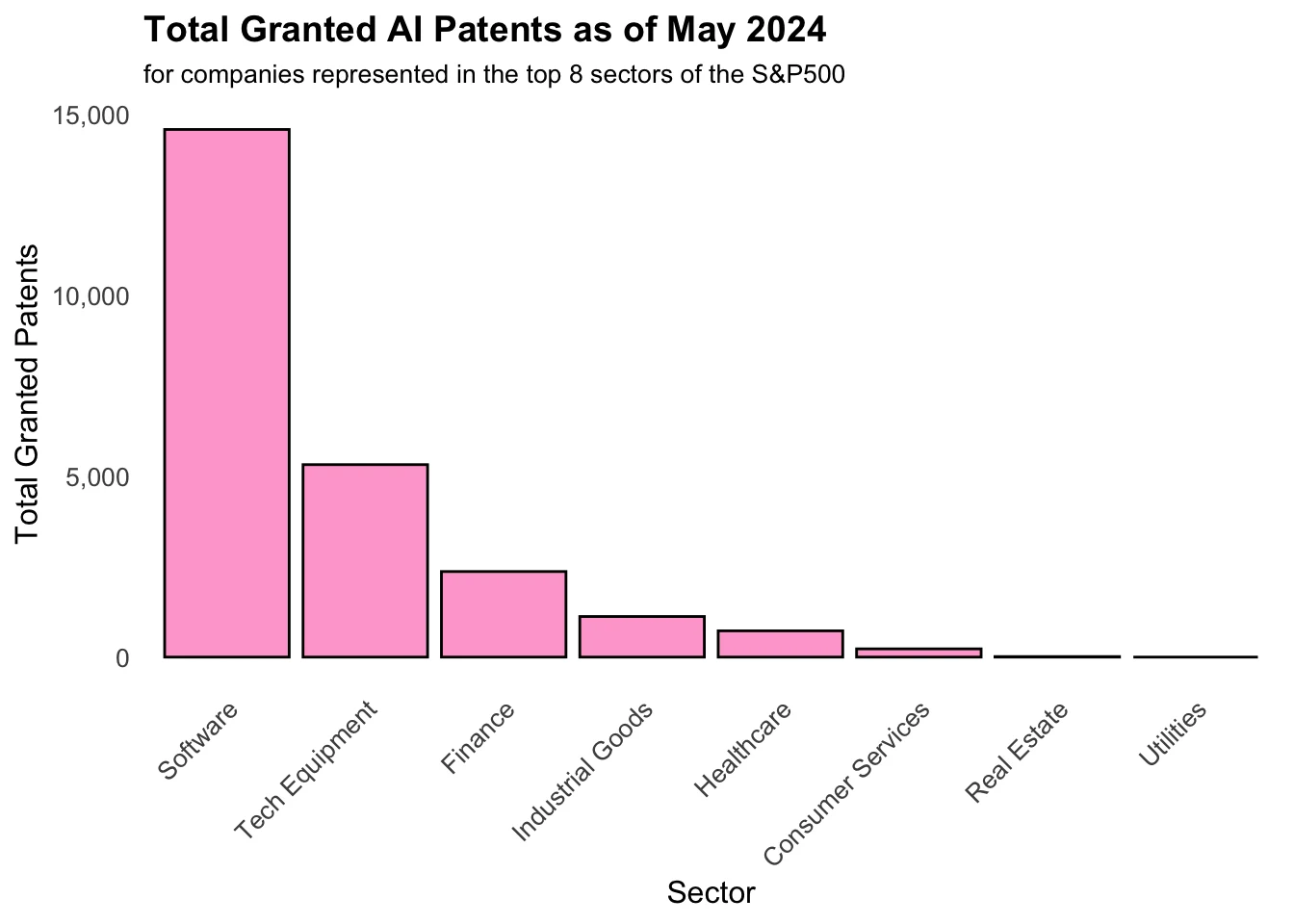
This data gives us a good idea of the breakdown of the AI granted patents from the top sectors as of 2024. We see that tech - both software and equipment - dominate in total granted patents. Though Real Estate and Utilities are heavily represented in the S&P 500, they have 0 AI related patents, illustrating the overall range of granted AI patents within these companies.
But how up to date are these numbers?
One thing to remember is that patent data is significantly delayed - the most recent 3 years of complete information reflect activity from 3-6 years ago. Like looking at the night sky, what we see now in this data is likely an echo from the past!
What additional information could help us fill in the gaps
This field is growing rapidly, and it would helpful to get an idea of where the workforce could be going.
What does the recent AI patent growth across sectors look like?
Recent AI growth in AI patents within our data set is measured as the average percentage increase per year over the last 3 years of complete data.
# Load required libraries
library(ggplot2)
library(dplyr)
library(stringr)  # For str_wrap function
library(patchwork)  # For combining plots

# Identify the top 8 sectors
top_8_sectors <- ai_patents %>%
  filter(Sector != "Unknown") %>%
  count(Sector) %>%
  arrange(desc(n)) %>%
  head(8) %>%
  pull(Sector)

# Assign sector abbreviations
filtered_data <- ai_patents %>%
  filter(Sector %in% top_8_sectors) %>%
  mutate(Sector_Abbrev = case_when(
    Sector == "Software & IT Services" ~ "Software",
    Sector == "Technology Equipment" ~ "Tech Equipment",
    Sector == "Pharmaceuticals & Medical Research" ~ "Medical",
    Sector == "Healthcare Services & Equipment" ~ "Healthcare",
    Sector == "Health Care" ~ "Health",
    Sector == "Banking & Investment Services" ~ "Finance",
    Sector == "Telecommunications" ~ "Telecom",
    Sector == "Chemical Industry" ~ "Chemicals",
    TRUE ~ Sector  # Keeps any unmatched names unchanged
  )) %>%
  mutate(Sector_Abbrev = factor(Sector_Abbrev))

# Create a base plot
base_plot <- ggplot(filtered_data, aes(x = Sector_Abbrev, y = recent.growth, fill = Sector_Abbrev)) +
  labs(
    x = "Sector",
    y = "Recent Growth (% increase)"
  ) +
  theme_minimal(base_size = 12) +
  theme(
    axis.text.x = element_text(size = 8, angle = 45, hjust = 1),
    axis.text.y = element_text(size = 10),
    plot.title = element_text(size = 14, face = "bold"),
    panel.grid = element_blank(),
    legend.position = "none"
  ) +
  scale_y_continuous(labels = scales::comma)  # Format large numbers

# Plot with outliers
plot_with_outliers <- base_plot +
  geom_boxplot(outlier.shape = NA, alpha = 0.7, color = "black") + #boxplot color changed to black and outlier shape removed
  geom_point(data = subset(base_plot$data, !is.na(base_plot$data$outliers)), #subset data to only include outliers.
             aes(x = Sector_Abbrev, y = Granted.AI.patents), #define x and y
             color = "blue", #color outliers blue
             shape = 16) + #shape of outliers
  ggtitle("Recent AI Patent Growth by Sector", subtitle = "for Companies in the S&P500")

plot_with_outliers 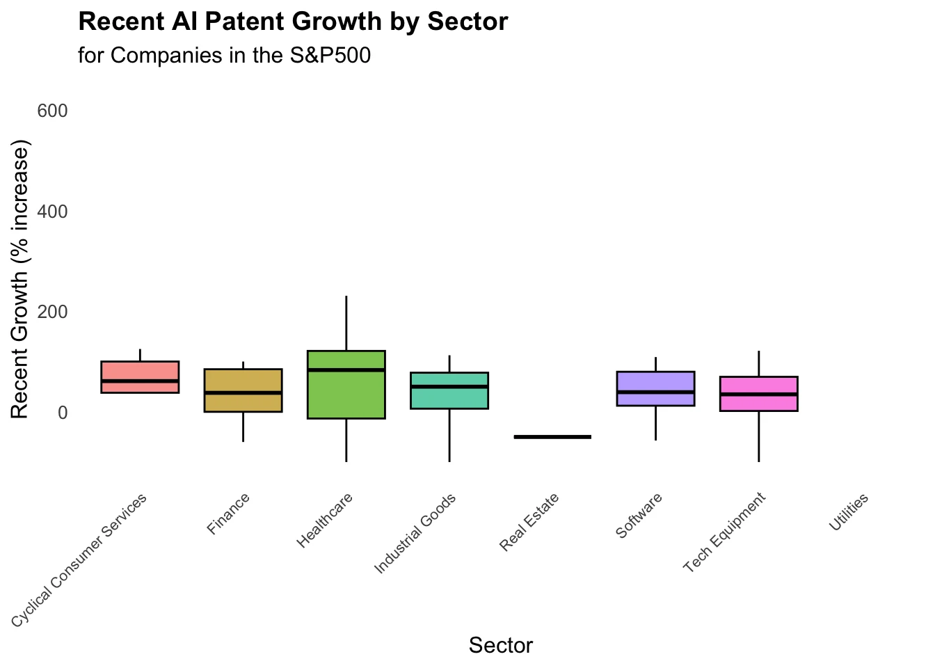
This chart shows us that the healthcare sector has the highest average and biggest range of AI-related patent growth between companies. Other industries with at least 1 granted AI-related patent generally had a range of within 100% growth, apart from Real Estate, which had negative growth.
Now we have a better idea of the AI workforce volume, the number of granted patents across sectors, and their recent growth. Next, let’s examine how the volume of the AI workforce and granted patents relate to one another!
We can get a more detailed look by again breaking the relationship up by the most represented sectors within the S&P500.
Multivariate Analysis: Granted AI Patents by Sector and AI Workforce
How does this relationship vary by sector?
Although the aggregate relationship between Granted AI Patents by Sector and the AI Workforce is highly positive, breaking out every sector of the S&P500 would depict that some contain slight negative or neutral correlations.
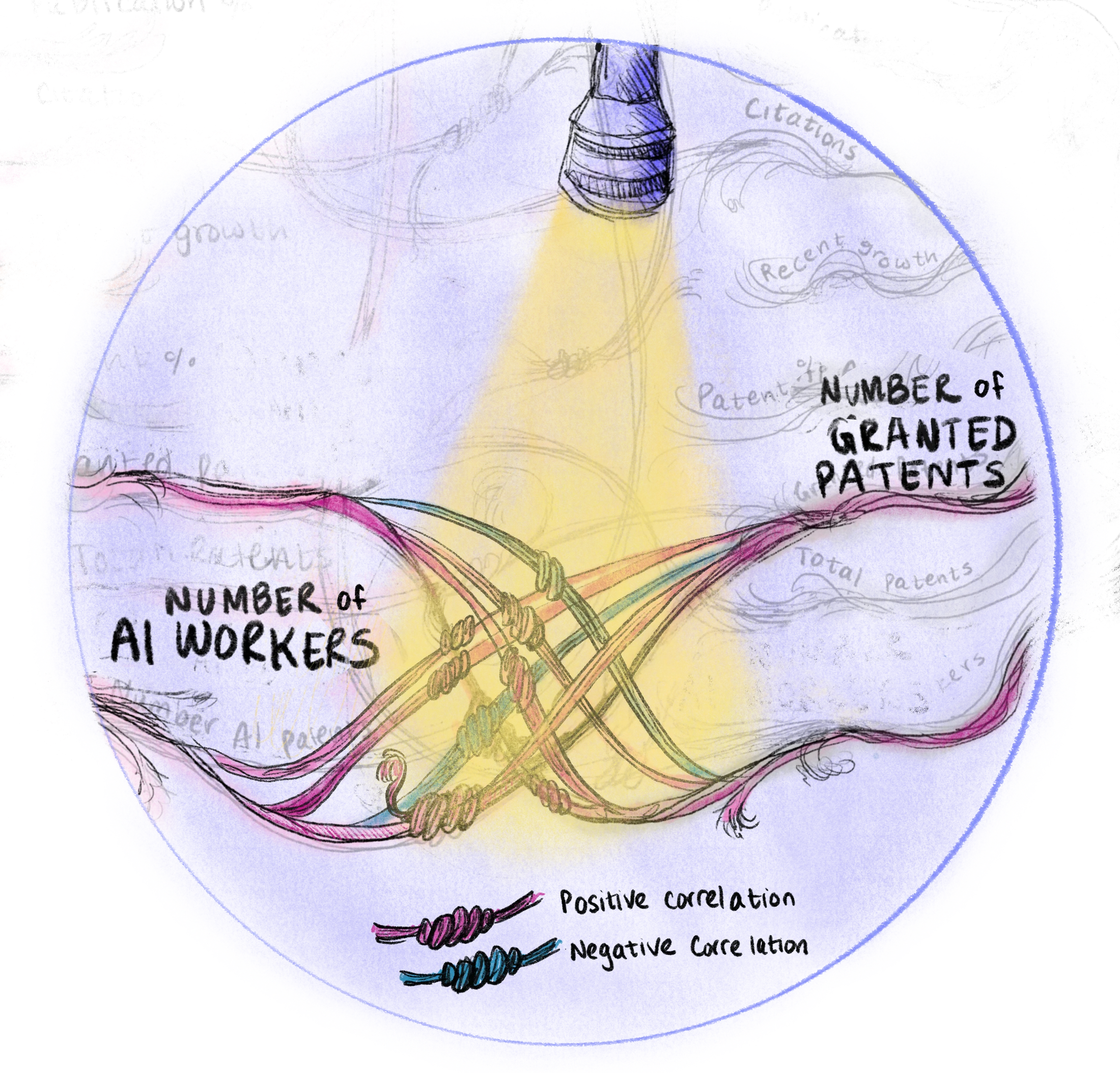
Figure 7: Detail Correlation Between Number of Granted AI Patents and number of AI Workers
To get a higher level, view, however, let’s just look at the top 8 sectors again.
# Get the top 8 most represented sectors by number of companies, excluding "Unknown"
top_8_sectors <- ai_patents %>%
  filter(Sector != "Unknown") %>%
  count(Sector) %>%
  arrange(desc(n)) %>%
  head(8) %>%
  pull(Sector)  # Extract sector names

# Filter dataset for only the top 8 sectors
filtered_data <- ai_patents %>%
  filter(Sector %in% top_8_sectors)

# Compute p-values for each sector using regression (AI workers → granted patents)
sector_pvalues <- filtered_data %>%
  group_by(Sector) %>%
  summarise(
    p_value = glance(lm(Granted.AI.patents ~ AI.workers, data = .))$p.value
  )

# Compute correlation values (Pearson correlation)
sector_correlations <- filtered_data %>%
  group_by(Sector) %>%
  summarise(correlation = cor(AI.workers, Granted.AI.patents, use = "complete.obs"))

# Compute mean AI workers and granted patents per sector
sector_means <- filtered_data %>%
  group_by(Sector) %>%
  summarise(
    mean_AI_workers = mean(AI.workers, na.rm = TRUE),
    mean_Granted_AI_patents = mean(Granted.AI.patents, na.rm = TRUE)
  )

# Compute max AI workers and patents for each sector (to position p-values)
sector_max_values <- filtered_data %>%
  group_by(Sector) %>%
  summarise(
    max_AI_workers = max(AI.workers, na.rm = TRUE),
    max_Granted_AI_patents = max(Granted.AI.patents, na.rm = TRUE)
  )

# Merge all computed values into dataset
filtered_data <- filtered_data %>%
  left_join(sector_pvalues, by = "Sector") %>%
  left_join(sector_correlations, by = "Sector") %>%
  left_join(sector_means, by = "Sector") %>%
  left_join(sector_max_values, by = "Sector")

# Fix text positioning: move p-value down slightly if it overlaps with the regression line
filtered_data <- filtered_data %>%
  mutate(
    p_value = round(p_value, 3),
    correlation = round(correlation, 2),
    text_y_position = max_Granted_AI_patents * 0.95  # Push text slightly down to prevent overlap
  )

# Rename sector names explicitly and drop the original `Sector`
filtered_data <- filtered_data %>%
  mutate(Sector_Abbrev = recode(Sector,
    "Software & IT Services" = "Software",
    "Technology Equipment" = "Tech Equipment",
    "Pharmaceuticals & Medical Research" = "Medical",
    "Healthcare Services & Equipment" = "Healthcare",
    "Health Care" = "Health",
    "Banking & Investment Services" = "Finance",
    "Telecommunications" = "Telecom",
    "Cyclical Consumer Services" = "Consumer Services",
  )) %>%
  drop_na(Sector_Abbrev) %>%  # Remove any NA values just in case
  mutate(Sector_Abbrev = factor(Sector_Abbrev)) %>%  # Ensure it's a factor for facet_wrap()
  select(-Sector)  # Drop original sector column

# Create scatter plot with regression lines, p-values, correlation values, and mean markers
ggplot(filtered_data, aes(x = AI.workers, y = Granted.AI.patents)) +
  geom_point(alpha = 0.7, color = "blue", size = 1) +  # Scatter points in blue
  geom_smooth(method = "lm", se = FALSE, color = "#FF69B4", linetype = 2, linewidth = 0.6, alpha = 0.6) +  # Tighter dashed regression line
  geom_hline(aes(yintercept = mean_Granted_AI_patents), color = "#B0B0B0", linetype = "dotted", linewidth = 0.3, alpha = 0.6) +  # Gray mean line
  geom_vline(aes(xintercept = mean_AI_workers), color = "#B0B0B0", linetype = "dotted", linewidth = 0.4) +  # Gray mean line
  facet_wrap(~ Sector_Abbrev, scales = "free", ncol = 4) +  # Facet by sector
  labs(
    title = "AI Workforce vs. Granted AI Patents (Top 8 Sectors)",
    x = "AI Workers",
    y = "Granted AI Patents"
  ) +
  theme_minimal(base_size = 12) +  # Keep text sizes consistent
  theme(
    strip.text = element_text(size = 9),  # Smaller facet titles
    axis.text.x = element_text(size = 8, angle = 45, hjust = 1),  # Rotate x-axis labels
    axis.text.y = element_text(size = 8),  # Adjust y-axis label size
    plot.title = element_text(size = 14, face = "bold"),
    panel.grid = element_blank()  # Remove background grid
  ) +
  scale_x_continuous(labels = scales::comma) +  # Format x-axis labels
  scale_y_continuous(labels = scales::comma) +  # Format y-axis labels
  geom_text(aes(
      x = max_AI_workers * 0.6,  # Move further left so it's visible
      y = text_y_position,  # Keep at text_y_position to avoid excessive height
      label = paste0("p = ", p_value, "\n r = ", correlation)
    ),
    hjust = 0, vjust = 0, size = 3, color = "#FF69B4", inherit.aes = FALSE  # Ensure visibility and clean placement
  )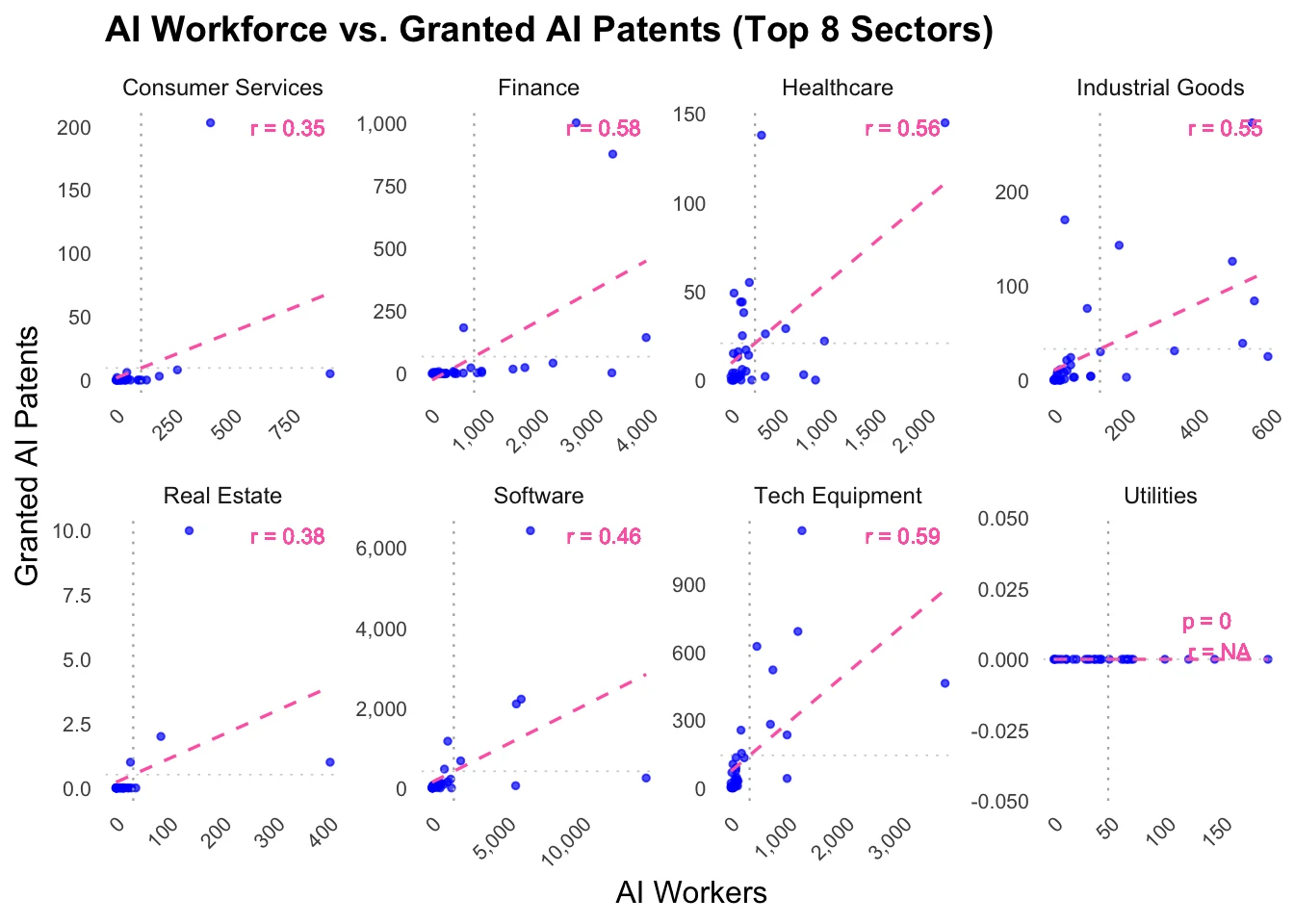
The scatter plots depict a positive correlation for all sectors that contain at least 1 granted patent as of 2024. The correlation coefficient varies across sectors, however, with consumer services having the weakest correlation workforce volume to number of granted AI patents and tech equipment having the strongest.
Next Steps?
Questions to keep looking into:- What are the key trends in AI patenting and research across states? (covers AI Patents & Innovation, AI Research & Publications)
- How does company size and funding correlate with AI innovation activity? (covers Company Metadata)
- What are the dominant areas of AI technology being published and researched? (covers AI Patents & Innovation, AI Research & Publications)